
Tesla is one of the most famous car companies in the world. But Tesla is not only about cars. It is also about design, style, and how things look. The way Tesla shows itself to the world is called “visual identity.” This includes the fonts it uses, the logo we all know, and the secret behind its powerful brand image.
Many designers look for modern, clean typefaces similar to Tesla’s style—there are places like Creative Fabrica where you can explore a wide variety, including a great free font download section to get started with strong, futuristic fonts.
Let’s take a closer look at how brands use design to make people remember and love their brand.
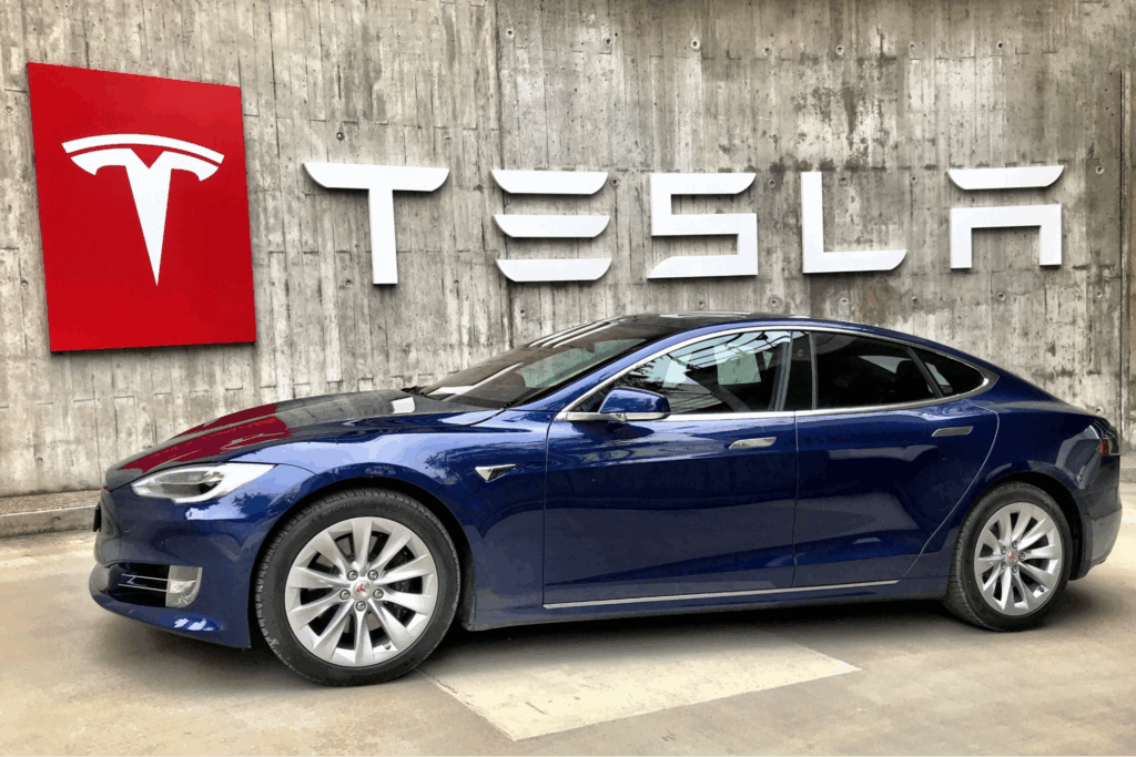
The Tesla Logo: More Than Just a “T”
At first, the brand logo may look simple. It is just the letter “T” with a sharp, modern look. But it has a deeper meaning. The “T” is not just a letter—it represents a part of an electric motor. This is a smart way to mix design and technology.

Many people say the Tesla logo looks futuristic. It gives a feeling of power, innovation, and change. That is exactly what the brand wants. They don’t want to be just another car company. They want to lead the future.
The color of the logo is usually silver or white. This choice is also part of the visual identity. Silver gives a sense of luxury and high-tech. It is clean, smart, and serious—just like Tesla’s cars.
Another smart thing about the logo is how it looks good everywhere. Whether it’s on a car, on a website, or on a mobile app, the Tesla logo always fits. That’s the sign of a great logo. It works in every size, in every color, and for every product.
Md Tamzid Mahmud Angkon once said:
“Your logo is your business’s first point of contact with the world. If people connect with your branding, they’ll be more open to what you’re offering. Great logo design requires a mix of design expertise, creative theory, and technical execution.”
This quote shows why the brand’s logo is so successful. It is more than just a design—it makes people feel something.
Tesla’s Fonts: Sharp, Clean, and Digital
Tesla uses strong and simple fonts in their designs. Fonts are the style of letters used in writing. The font helps show the feeling of the brand. Tesla’s font is very clean, with straight lines and no curves. It feels like the future—just like their cars.
The main font used by Tesla is very close to a typeface called Eurostile, especially the Eurostile Extended version. This typeface is often used in sci-fi movies and space-themed posters. That is not a mistake. Brand wants to feel like it comes from the future, not the past.
In recent years, Tesla also started using more simple fonts on their website and screens, like Proxima Nova or similar web fonts. These are easy to read and work well on phones and computers.
If you like fonts like Tesla’s, you can find many similar styles on Creative Fabrica, where designers post beautiful and free typefaces. Again, check out their free font section to explore.
Branding Secrets Behind Tesla’s Look
Tesla’s design choices are not random. Every font, every color, and every logo shape is chosen with care. The company wants people to feel a certain way when they see the Tesla brand.
Here are some secrets behind Tesla’s strong branding:
- Consistency: brand uses the same fonts, colors, and logo everywhere. On the car, in the app, on social media—it all looks the same. This helps people trust the brand.
- Minimalism: Tesla keeps things simple. No extra lines, no bright colors, no busy designs. Just clean, clear visuals. This matches the look of their cars.
- Innovation: From the font to the logo, everything feels new. Brand wants to look different from old car companies. They want to feel like a tech company.
- Emotion: Tesla doesn’t only sell cars. They sell a feeling of power, change, and the future. The design helps people feel this emotion.
Good branding is not just about looking nice. It’s about making people remember you. Tesla does this well, and many companies try to copy their style.
Fonts for Your Own Brand: Get Inspired by Tesla
If you like Tesla’s look and want to make your own brand feel modern and strong, you can start by choosing the right font. Fonts are easy to use, and they make a big difference.
When picking a font, think about what feeling you want people to have. Do you want to feel like the future, like Tesla? Or soft and friendly? Or maybe bold and loud?
Tips for choosing your font:
- Use simple fonts for a modern look.
- Avoid too many different styles.
- Make sure your font is easy to read on all devices.
- Choose a font that matches your logo and product style.
If your font and logo work well together, your brand will be stronger.
Final Thoughts
Tesla shows us how good design can make a brand unforgettable. The sharp logo, the smart use of fonts, and the clear, clean branding all come together to create something people remember. Whether you are building a company, a website, or just want to make cool designs, Tesla’s style can teach you a lot. And remember—you don’t need to be a big company to have a great visual identity. All you need are the right tools and ideas.
Great branding is not a secret. It’s a smart mix of design, emotion, and keeping things simple. Tesla proves that.